Consider the following facts of why customers opted not to go to a particular restaurant:
- The website was difficult to navigate (33%)
- Menus were difficult to read (30%)
- Website looked out of date (30%)
A bad restaurant website can put off your customers. That is why you want to make sure that your website is as good as it can be.
But what makes good restaurant website designs?
We’ve assembled this guide to some of the best restaurant website designs that will inspire you to make your own.
[ez-toc]
What Makes Good Restaurant Website Designs?
Restaurant website designs can vary based on several factors such as the menu, location and type of restaurant.
Despite restaurant designs varying, there are still qualities that most great restaurant websites have in common.
Below are some of the key features of top restaurant website designs, according to our experts.
1. User-Friendly Design
A user-friendly design is paramount to the success of any restaurant website.
Intuitive navigation, clear menu structures and easily accessible information contribute to a positive user experience.
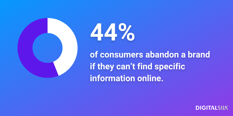
Considering that 44% of consumers would abandon a brand after failing to find specific information, you want to make any relevant information easily visible and accessible to your website visitors.
2. Visible Social Media Handles
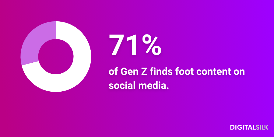
71% of Gen Z finds food content on social media and online platforms influence their dining choices.
Integrating social media platforms and making them visible in the header is a sure way to let your customers easily find you beyond your website.
This not only enhances engagement but also extends the restaurant’s online presence beyond the website, giving prospects additional points of contact.
3. Comprehensive Food Menu
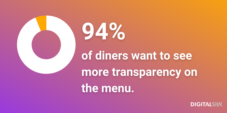
94% of diners want more transparency on menus — going beyond mere price, diners also want allergen and “organic” food notices to be clearly visible.
A comprehensive and readable menu is a cornerstone of a good restaurant website.
Include concise descriptions of meals, clear categorization and show your prices to help customers make informed decisions about their dining choices.
Providing allergen information and dietary preferences further demonstrates transparency, catering to a wider audience.
4. High-Quality Visuals
Captivating visuals play a significant role in the overall appeal of a restaurant website.
Customers are more likely to visit your restaurant if they can see the images that adequately represent your establishment.
High-resolution images of the interior, dishes and staff create an immersive experience, enticing visitors to envision themselves enjoying a meal at the establishment.
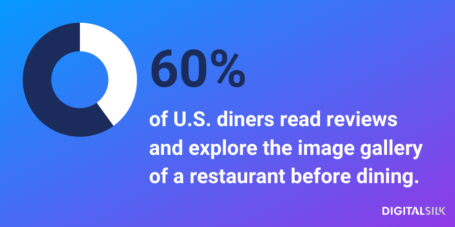
Consumer-generated content, that is, photos and videos posted by the restaurant-goers, influence up to 60% of U.S. diners.
5. Clear Calls-To-Action (CTAs)
Effective restaurant websites feature clear and strategically placed calls-to-action.
A call to action is a prompt or directive that encourages the audience to take a specific action.
Whether it’s making a reservation, placing an order or signing up for newsletters, CTAs guide visitors on the desired path.
Well-designed buttons and prompts encourage interaction, streamlining the customer journey and boosting conversion rates.
A good restaurant CTA should include the following elements:
- Clarity: Make your CTA clear — your website visitors should immediately understand what is expected of them.
- Conciseness: Make your CTA short; it shouldn’t be longer than a couple of words (e.g., “Make a reservation,”, “Explore Menu” and “See Locations”).
- Visibility: Make the CTA stand out by using a different color or font from the rest of the page.
- Compelling Language: Use persuasive and action-oriented language. Phrases like “Book Now,” “Order Today,” or “Limited Time Offer” encourage action and help convert more customers.
- Relevance: Tailor CTAs to the specific goals of your restaurant. If reservations are a priority, focus on “Reserve a Table.”
6. Responsive Design
With nearly 60% of global internet traffic coming from mobile devices, having a responsive website design is non-negotiable.
Restaurant websites must adapt seamlessly to various screen sizes, ensuring optimal viewing experiences on desktops, laptops, tablets and other devices.
Given that many of your potential visitors will explore your restaurant website through their phones, the mobile experience needs to be as effective as the desktop one.
This adaptability not only enhances user satisfaction but will also help your website come up first on Google and other search engines.
7. Your Story
Every restaurant has a unique story to tell, and a compelling narrative can set a website apart.
Talk about how your restaurant came to be, your journey and what makes your restaurant unique.
Feature it on your website in “Our Story” or “About Us” sections and let your prospects connect to your journey.
Other engaging content, such as chef profiles and behind-the-scenes glimpses, also foster a sense of authenticity, making the restaurant more relatable to potential customers.
15 Best Restaurant Website Designs
We understand the intricacies of a custom restaurant website design and how an effective restaurant website can directly impact your sales for the better.
From headers and footers to strategic CTAs, our experts created a list of 15 best restaurant website examples to inspire you and help you create your own.
1. Sono
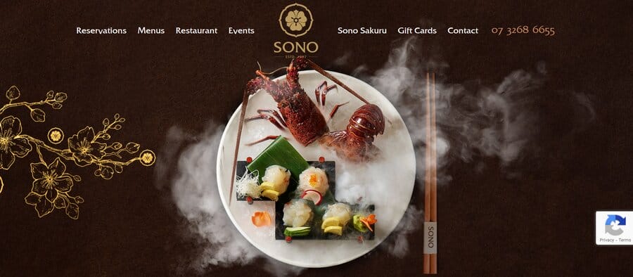
Sono is a Japanese restaurant in Brisbane, Australia.
Their website’s home page immediately features one of the restaurant’s delicious-looking dishes.
In the header, Sono includes staple information of good restaurant websites:
- Reservations
- Menu
- Contact
- Phone number
However, after scrolling down on Sono’s home page, customers will find the “Awards” section, showcasing numerous accolades the restaurant has received.
Sono’s design blends aesthetics and functionality — the website has an aura of mystique, conveying the feel of the restaurant itself, while still providing all the relevant information.
Through headers, awards and images, the website gives potential visitors all the information they may need to decide whether to eat at Sono.
2. Headwaters Restaurant & Pub
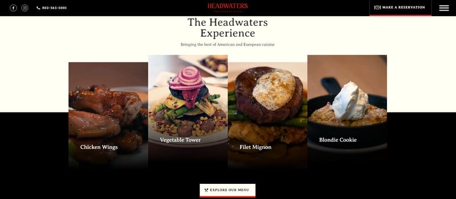
Headwaters is a Digital Silk client, offering its customers a classic pub and fine dining experience.
The restaurant’s tagline “Vermont vibe. World class cuisine” emphasizes the blend of Vermont hospitality with global cooking standards, something the website proudly displays on their home page.
Through a simple design and few words, Headwaters efficiently relays its message: come and have a great time.
The restaurant offers contact information in the top heading, displaying icons for Facebook and Instagram right next to the phone number.
This ensures that prospects can easily find the restaurant online and explore Headwaters’ content further.
Headwaters also expertly uses an image gallery to showcase menu items like the Vegetable Tower and Filet Mignon.
The website also features a strategically placed CTA inviting potential diners to “Explore Menu.”
3. Adachi Restaurant
Adachi restaurant prides itself as the best sushi restaurant in Michigan.
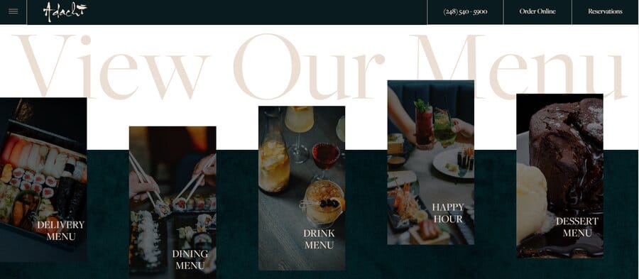
Their website has a very modern design with expert flow of the pages, meaning it has a minimalistic layout to showcase the freshness of their products, from maki rolls to delicious-looking cocktails.
In the top menu, Adachi includes social media links, phone number and two CTAs in the top right-hand corner urging the website visitors to place an online order or make a reservation.
Additionally, Adachi segregates its menu on whether customers are looking for delivery or dining in, allowing prospects to easily find information that will help them decide whether to eat at Adachi.
4. Pizzeria Vetri
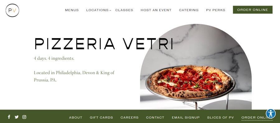
Pizzeria Vetri, an authentic pizza place in Philadelphia, employs a simple yet effective website design to showcase its offerings.
Using minimal text, it succinctly conveys the most important information a visitor might be looking for:
- Menu
- Location
- Event hosting
- Online orders
Vetri employs a sticky header and footer on the website, meaning that you always see them as you scroll down Vetri’s website.
In the footer, the website features contact forms, email sign up and social media handles, giving prospects an opportunity to not only contact the pizzeria but also to sign up to receive news and updates.
Vetri’s website also features high-quality images that are artfully placed in shapes resembling a brick oven — further emphasizing the restaurant’s branding as an authentic pizza place.
5. Barton G
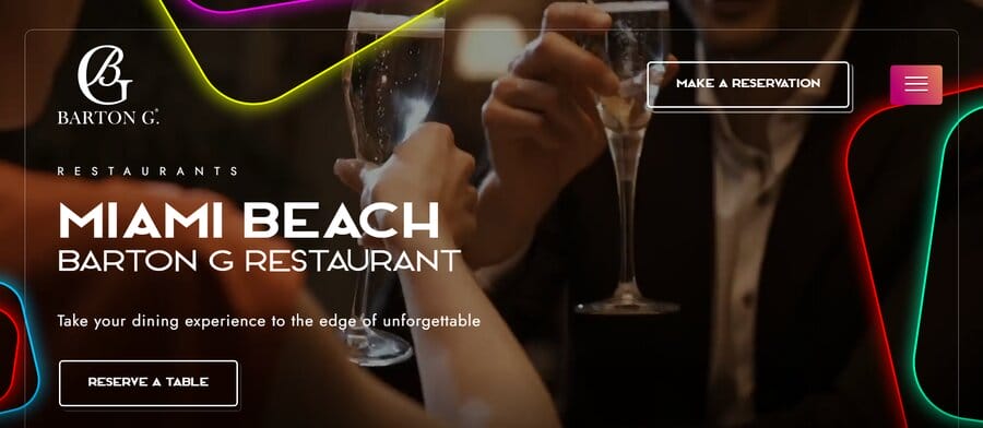
Barton G offers their customers a unique and immersive dining experience, something that our designers wanted to reflect in Barton’s engaging website design.
The restaurant’s website, which offers prospective customers multiple options from events and restaurant dining to large parties and private dinners, relies on bright and high-quality images to emphasize potential options.
To engage users, the home page has two calls-to-actions that stand out: “Reserve a table” and “Make a reservation,” which pop up on the page.
Barton G’s website has a very natural flow: navigation is intuitive and layout is structured to prioritize important information.
Additionally, Barton G relies more on images and design than on text, conveying its most important offerings in just a few words.
6. Sophias Urban Bistro & City Garden
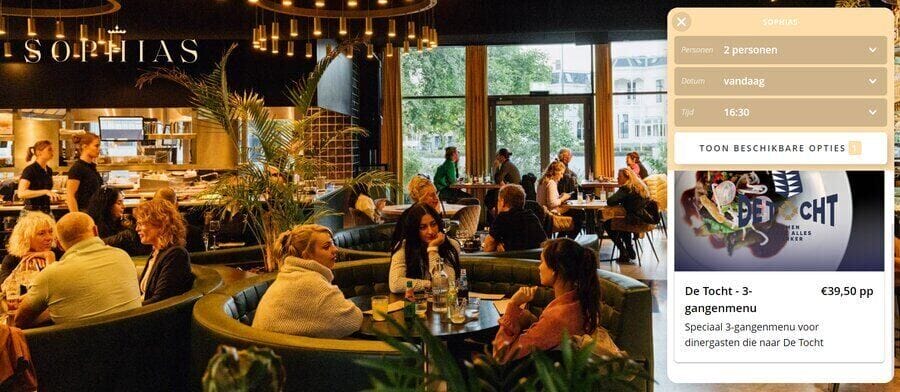
Sophias is a Dutch restaurant with an elegant and sleek website.
The website conveys professionalism and exceptional fine dining experience.
You will immediately be greeted by a large image of the bistro’s dining area, relaying not only the look but also the feel of the packed bistro.
Scrolling further down, you will encounter two separate sections for the restaurant’s “Drinks and dinner” and “Cocktails and bites” options — showcasing, once again, a garden full of guests.
Perhaps it’s not a surprise that a sticky “Reserveren” button constantly follows you as you scroll through the website, suggesting the bistro’s availability upon clicking.
7. Bavet
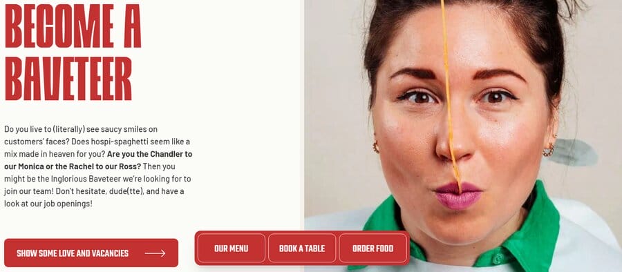
Bavet has one of the most original restaurant website designs out there.
The restaurant relies on several gimmicks — it serves the food on vinyl which is placed inside a menu shaped like a record sleeve. Then, a lucky customer who finds red vinyl inside their sleeve gets a meal on the house.
These serve as selling points to attract new users and Bavet’s website highlights all of the different engaging options that the restaurant offers.
Placing the emphasis on the experience, the website includes images of the food and videos of happy guests to serve as social proof, from individuals enjoying their meals, to lucky finders of the red vinyl.
The restaurant in Belgium also turned its menu, reservations and delivery options into sticky buttons that follow you as you scroll down their website.
After supplying users with all the relevant information and fun and engaging content, the website invites you to become a “Baveteer” and subscribe to the newsletter.
It helps if you’ve seen Friends.
8. La Crema
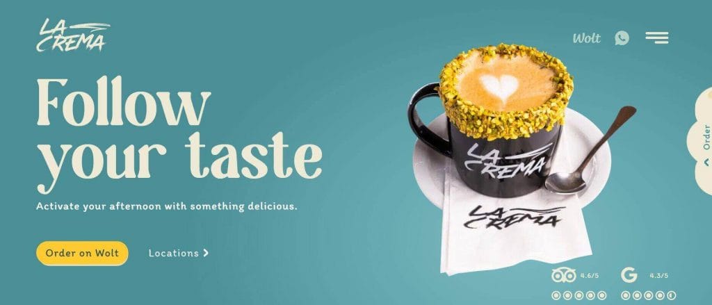
La Crema is a restaurant in Malta with a colorful and succinct design.
When you go on their website, you can click on TripAdvisor and Google icons which will take you to the respective review pages showcasing the restaurant’s whopping 4,5 ratings.
By linking to online reviews, La Crema’s website immediately demonstrates the quality of the restaurant’s offerings.
However, the website doesn’t tell it outright; instead, interested individuals can find third-party reviews through a click on La Crema’s website.
To highlight the delivery option La Crema offers, the website features sticky “Order” buttons on the side and on the bottom of the page, making sure that visitors are never too far away from placing an order.
9. Brody’s Barbecue
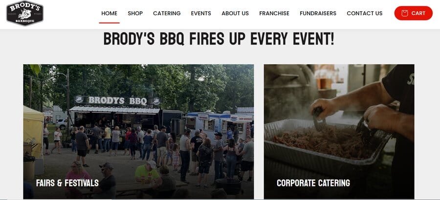
Brody’s Barbecue is a food truck catering service that started during COVID and now has an impressive fleet of five trailers and over 1,000 square feet of culinary artistry.
The restaurant is a prominent participant in fairs and festivals and is constantly on the move across the U.S. This is an important piece of information that Brody’s features in their “About” section.
Brody’s website showcases its dedication to authentic barbecue through a simple design emphasizing the journey from a single roadside tent to an award-winning fleet of five trailers.
The website gives you all the relevant information right away: from their contact information to social media handles.
The food truck company also includes a section on “Fairs & Festivals” sharing its upcoming locations along with different catering options that Brody’s offers.
Interested parties can find Brody’s locations by calling them or, for those seeking BBQ catering options, it is possible to book Brody’s for corporate events and similar gatherings.
10. Sweetgreen
Sweetgreen immediately conveys its unique selling point of dedication to plant-forward, eco-friendly food.
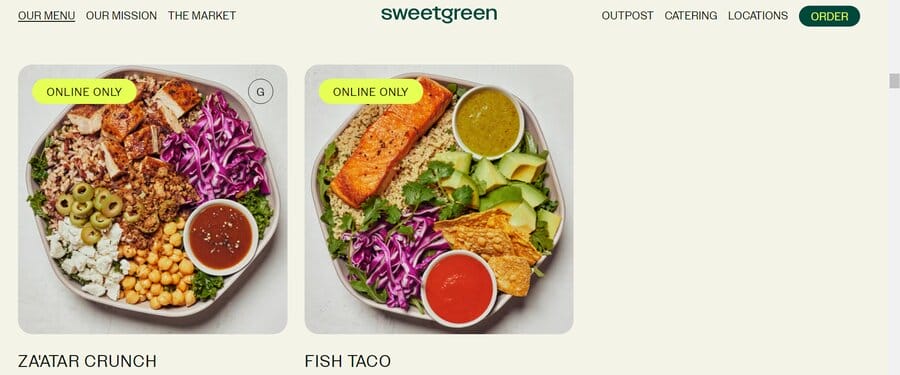
After including all the restaurant’s relevant information in the heading (such as “Menu” and “Order”) Sweetgreen jumps into the media library displaying some of its most delicious, healthy meals.
In a section dubbed “Protein Plates,” this healthy restaurant lists the nutritive values of each of their meals.
Along with a high-quality image of the food, Sweetgreen also includes a stamp for meals that are only available through the “Delivery” option, helping website visitors decide on whether they wish to dine in or try some of their “Online only” options.
Sweet-green is a large franchise with locations all over the United States.
To navigate the restaurant’s ever-expanding locations, their website features a “Locations” button in the header, showing the numerous Sweetgreen stores around the U.S.
11. Sunday in Brooklyn
Sunday in Brooklyn is a restaurant in Williamsburg, Brooklyn.
With an elegant and simple design, the website offers important information in the header that is followed by a moving image gallery, displaying some of the restaurant’s signature dishes.
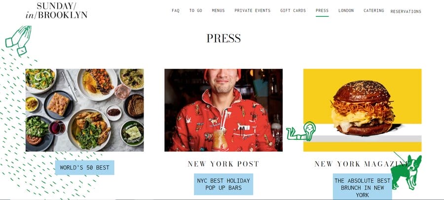
Aside from the necessary contact and information, Sunday in Brooklyn also has a “Press” section in its header.
It takes you to a collection of articles from New York outlets, such as The New York Post and The New Yorker which dubbed the restaurant as “The Absolute Best Brunch In New York.”
This section builds credibility and has the potential to attract new customers by enticing them to try Sunday’s food through positive reviews.
12. Hiden
Hiden is a Miami-based Japanese restaurant.
It operates as a traditional omakase, meaning that the chef decides the menu on the day you visit the restaurant, and the food is served and prepared in front of you.
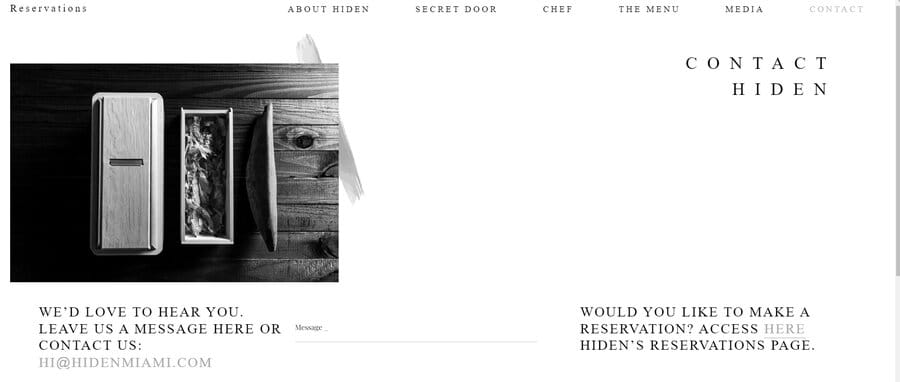
However, Hiden’s locations are secret — and the website keeps the aura of mystery through minimalist design and black and white palette.
The only way you can make a reservation in Hiden is through the restaurant’s “Contact” button, visible in the header.
By clicking it, you reach Hiden’s reservation page, letting you choose the date, time and party size, according to the restaurant’s availability.
The website doesn’t feature a lot of content, playing into the idea of secrecy and relaying only the most important information such as the number of seats, allergens and other dietary information.
Additionally, the website features strategically positioned CTAs which encourage the user to explore the “Contact” page.
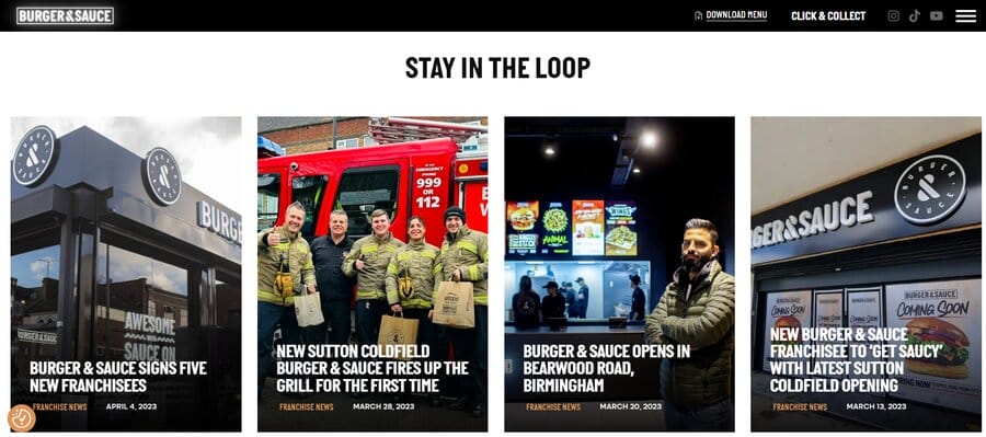
13. Burger & Sauce
Burger & Sauce is a popular U.K. burger joint.
The franchise was started during the pandemic and now has restaurants in 11 locations.
Burger & Sauce has been steadily expanding ever since its conception.
This information is made easily available on the restaurant’s website — with a section titled “Stay in the Loop,” the restaurant posts franchise updates such as the openings of new locations and new product offerings.
Burger & Sauce includes all the relevant information in their website footer, while the website’s header contains a downloadable link to Burger & Sauce’s menu.
After providing prospects with all the information they may need, Burger & Sauce also includes a “Testimonials” section on their website, giving potential customers a glimpse of the positive experiences the restaurant offers.
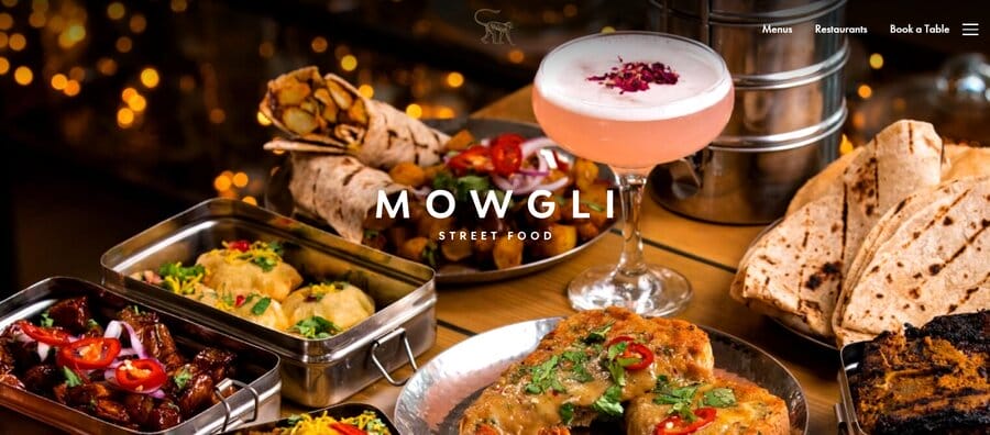
14. Mowgli Street Food
Mowgli Street Food is an eatery in England.
Its website is an elegant blend of simplicity and sophistication.
Without too much text or images, Mowgli manages to convey its authentic Indian feel, through visuals showing its delicious food and the restaurant’s interior.
Aside from the “Menus,” “Locations” and (a sticky) “Book A Table” buttons visible in the header, the website also includes the section on charity and sustainability, demonstrating Mowgli’s values and appealing to like-minded people.
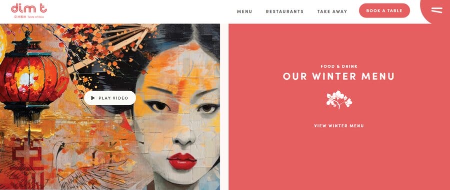
15. Dim T: Taste of Asia
Dim T is an Asian restaurant with a website that seamlessly blends aesthetics and functionality, combining functional design with East Asian-inspired visual elements.
The website is neatly organized with clear sections for easy navigation.
As you scroll down, you will encounter high-quality images of the restaurant’s delicious-looking meals.
Scrolling further down will give you an artfully crafted design equally divided into boxes, combining form and function to convey important Dim T information ranging from locations, menu and a video showcasing the freshness of Dim T’s ingredients.
What makes Dim T’s website stand out is its flow — the content is easy to navigate, the content isn’t cluttered and every potential visitor will find any relevant Dim T information as soon as they land on their home page.
How To Design Restaurant Websites
Now that we’ve seen the elements of successful restaurant website examples, we can look at how to design one that works for you.
Below is a step-by-step guide on how to create an effective restaurant website.
Step 1. Define Your Goals
Before diving into the design process, clearly define your restaurant website’s goals.
Whether it’s increasing reservations, promoting online orders or enhancing brand visibility, having specific objectives will guide your design choices.
Step 2. Choose A CMS That Works For You
Selecting the right Content Management System (CMS) is crucial for maintaining and updating your restaurant website.
Choose a CMS that aligns with your technical skills, scalability needs and flexibility for future updates.
If you’re unsure of which CMS to use, you should reach out to an expert and request a custom quote to help you with a CMS that works for you.
Step 3. Create A Custom Design
Craft a unique and tailored design for your restaurant website that reflects your brand identity and sets you apart from competitors.
Consider factors like color schemes, layout and overall aesthetics to ensure a cohesive and visually appealing design.
These elements are not only there to make your website look pretty — they are important brand elements that will help you attract more customers.
For example, visual consistency can boost revenue by over 30%.
Step 4. Create Engaging Content And Optimize It
Craft compelling and relevant content for your website, including restaurant history, menu descriptions and engaging visuals.
Optimize content for search engines by incorporating relevant keywords, improving your website’s discoverability and following SEO best practices.
Step 5. Include A Menu
A clear and easily accessible menu is a fundamental component of any restaurant website.
It’s best to include high-quality images, concise descriptions and allergen information to help customers make informed choices.
To provide your potential customers with even more information, you can also indicate the calories and the sources of the ingredients for each meal.
Step 6. Integrate An Online Ordering Option
Facilitate online orders by integrating a user-friendly and secure online ordering system.
Streamline the process to enhance user experience, encouraging customers to order directly from your website.
If you don’t offer online orders, speak to a developer about integrating a third-party delivery company.
Step 7. Ensure Your Website Is Responsive
Given the prevalence of mobile users, ensure that your restaurant website is responsive across various devices.
This means that your restaurant website performs optimally, whether accessed through desktop or mobile.
A responsive design guarantees optimal user experience, which is essential for attracting and retaining customers and performing well with Search Engines.
Create Custom Restaurant Website Design With Digital Silk
Digital Silk is a full-service web design agency.
That means we have extensive experience in design, development and optimization of numerous websites across industries.
We understand the intricacies of a restaurant website and how to help you stand out from the saturated dining industry.
Our design services include but are not limited to:
Have a web design project in mind?
Call us at (800) 206-9413 or contact our team to set up a consultation and receive a custom quote for your project.
"*" indicates required fields


